ALEX HSA
The Challenge
In early 2019, Jellyvision partnered with HSA Bank to develop our own ALEX Health Savings Account and Flexible Spending Account product. Our mission – use our proven approach to behavior change to get people to put more in their HSAs and spend less on health care by maximizing their other employer benefits.
The Solution
We designed a new dashboard frontend that put greater emphasis on personalized benefits education and action items.
HSA account holders log in to their online accounts an average of seven times a year, so our approach at first was two-prong – get them to activate their online accounts via a targeted email nurture campaign so they'd be opted in, then use those moments of captured attention while they were logged in to provide personalized action items that exposed money-saving opportunities across employer benefits beyond their HSA.
I helped concept, iterate, and user test our approach to the dashboard, and wrote all the microcopy, page copy and FAQs used throughout the application. I also wrote the emails, including A/B test variants on subject line and CTA labels.
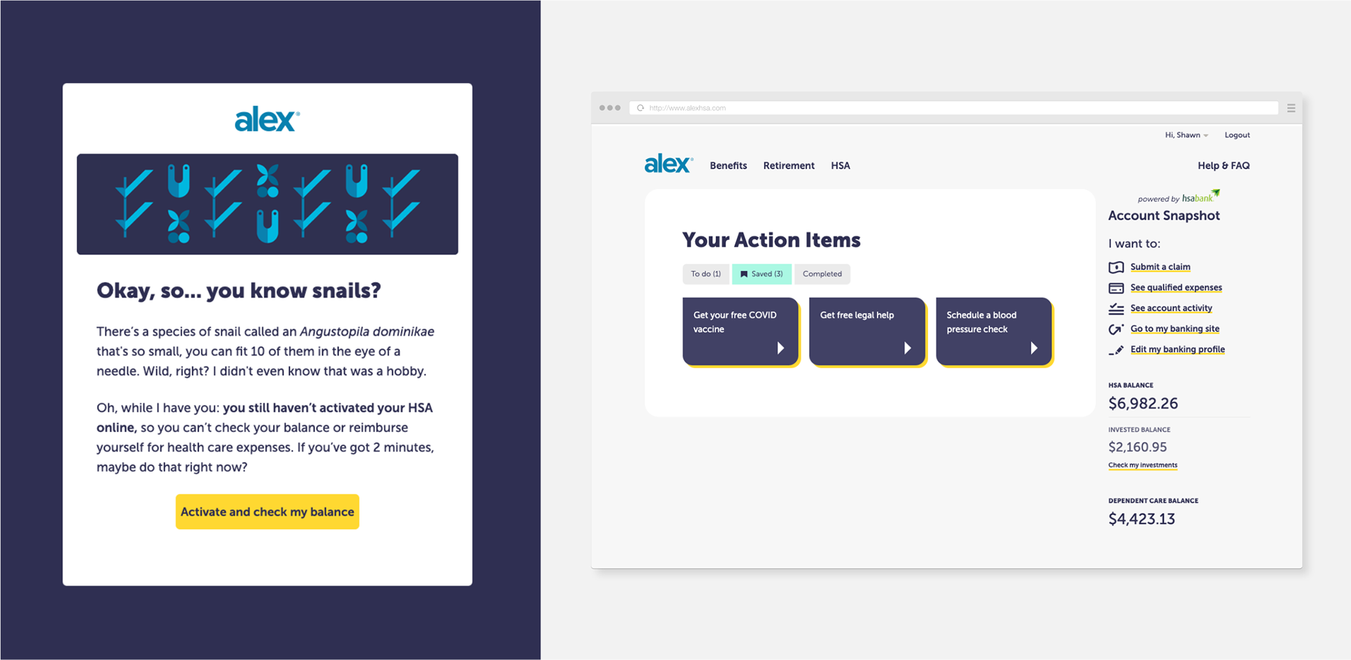
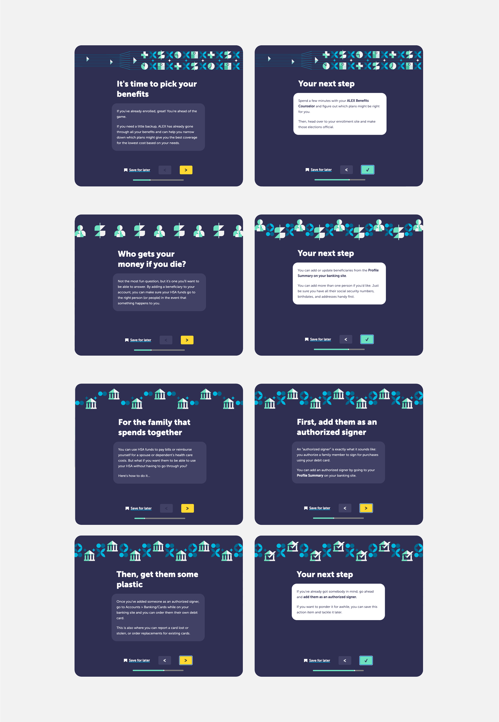
The bulk of the content within the app comes in the form of Your Action Items, which are bite-sized nuggets of education that always end with an actionable next step that the user could do right then and there to save themselves time, money, or confusion.
I wrote about 30 of these Action Items for launch and worked with our devs to come up with a rough prioritization system that combined employer and date-range conditions, user variables, and an overall priority score to determine what a user would be given each time they logged in.
I also developed a content map for the first year after launch as we continued to refine and expand the pool of Action Items available to be displayed.
Here are a few samples:
I implemented this content and managed updates directly within our Kentico Kontent CMS and worked with developers to scope necessary variables and conditions to make it all work.
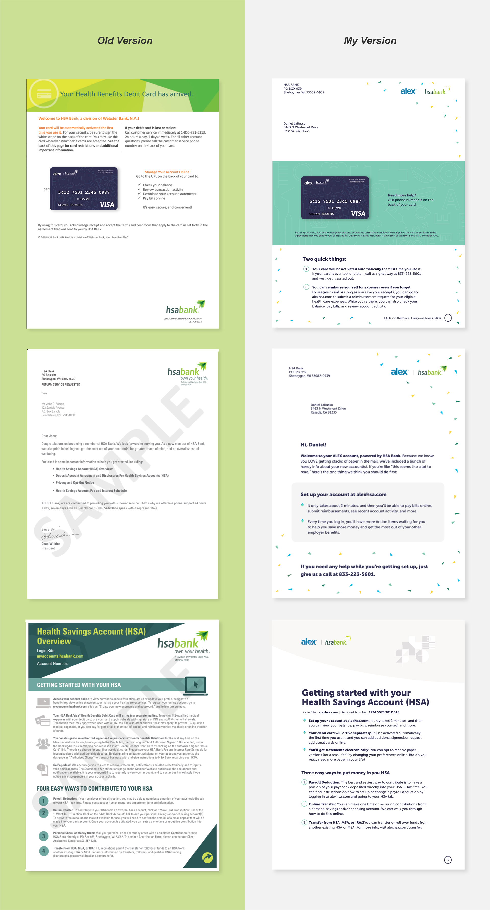
I also oversaw the revamp of printed materials for first time user welcome kits and promotional mailers. On a lot of these, there was a certain parity of information that was required just from a legal standpoint, but I worked closely with our designer to reorganize, de-jargon, and trim as much as we could.
The end results feel less overwhelming and bank-y, while emphasizing our internal goal of getting people to activate their accounts online.