Mercury Help Center
The Challenge
Customers were skipping our help center and going straight to our customer support team for even the simplest issues. And we couldn't really blame them – the help center was a bit of a Frankenstein's monster. Content was added ad hoc by individual product teams, causing inconsistencies in structure and style. It was powered by an off-the-shelf CMS designed more for user forums than help centers. And lack of content governance caused articles to get quickly outdated, which is almost less helpful than having an article at all.
The Solution
I joined our customer experience team and worked with product and engineering leads to drive creative on a down-to-the-studs redesign. Our goal – create a more approachable and accessible help center to try and encourage self-serve troubleshooting and lower the overall CS ticket volume.
As our engineers kicked the tires on a new headless CMS, I got to work auditing the existing content to figure out what could be updated, combined, or cut entirely. I used search results and traffic stats from the previous CMS to prioritize featured content, and ran card sort exercises with customers to make sure articles were grouped intuitively by the types of actions users were trying to complete. This information architecture work powered the design of the new standalone help center's nav.
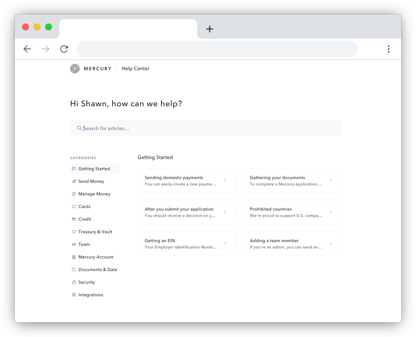
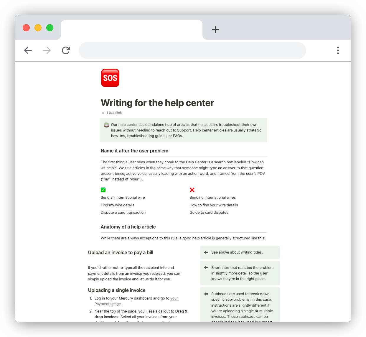
I established writing guidelines and content anatomy, then translated that into docs and templates that future contributors could use to create new articles. With standards established, I personally rewrote the first wave of updated content (~50 articles) to make sure they adhered to these guidelines.
Beyond the standalone help center, I also worked closely with one of our product designers to replace an in-dashboard Intercom implementation with a portable version of the help center that encouraged self-serve troubleshooting before contacting a human.
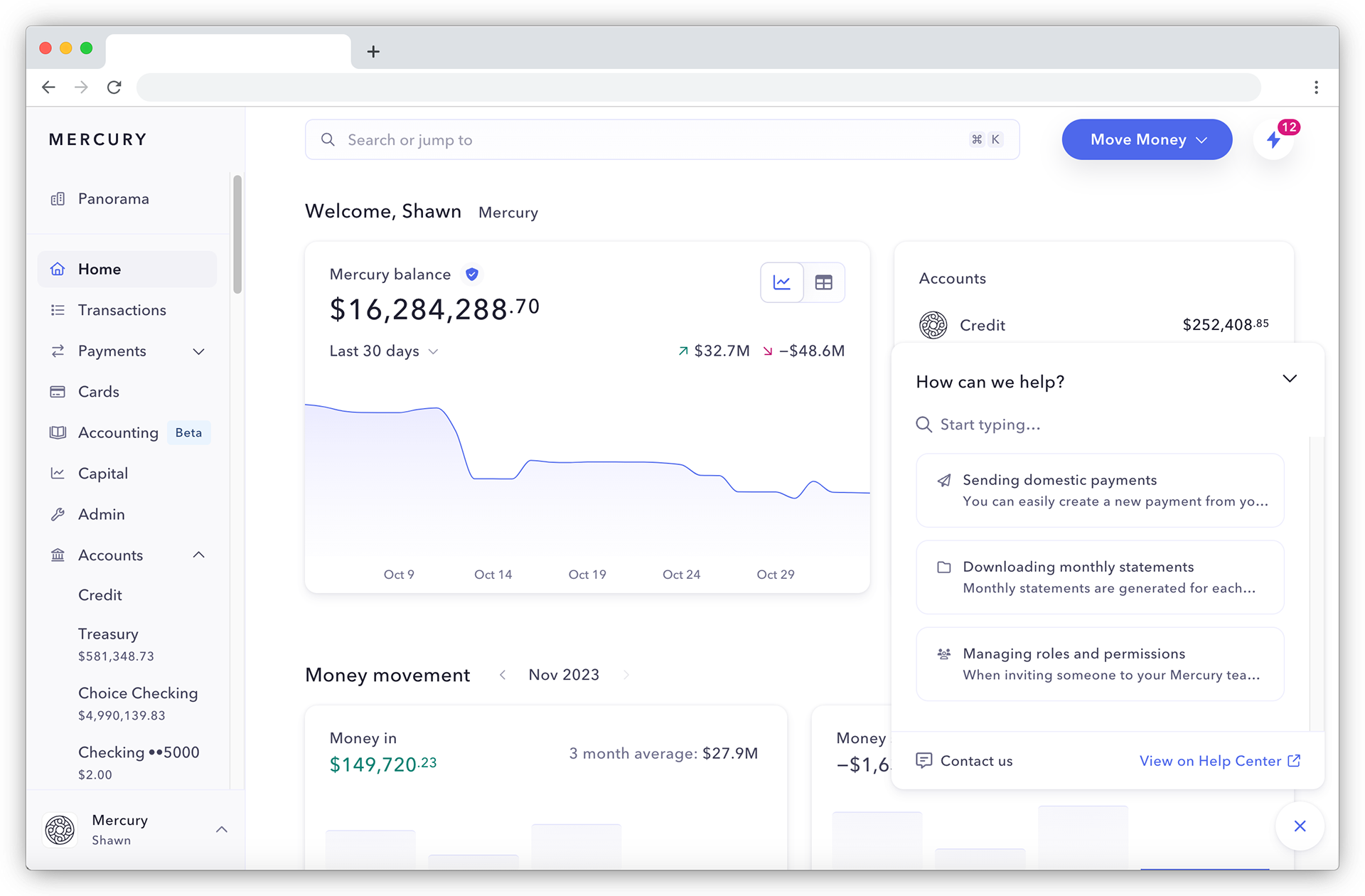
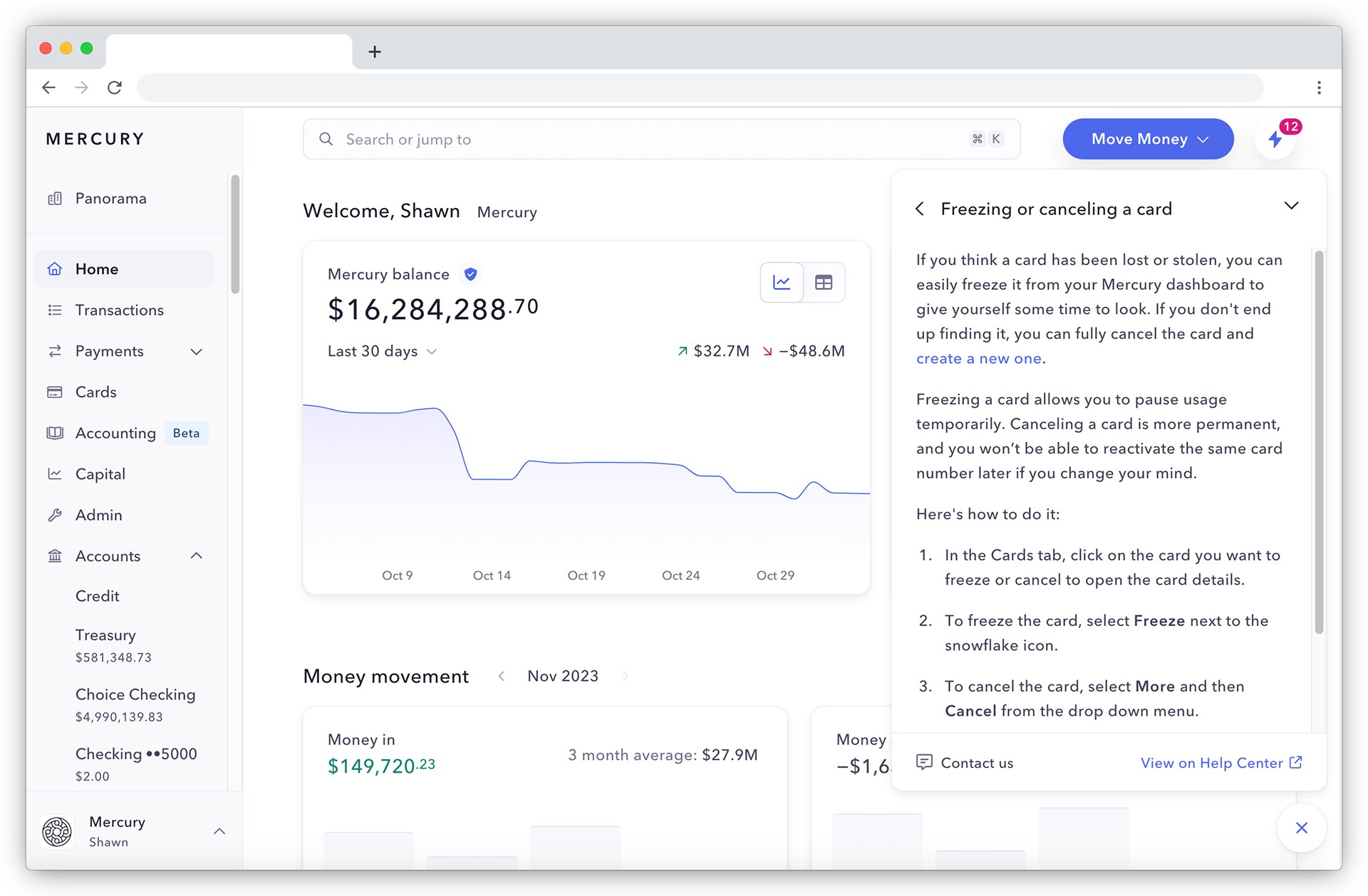
This ended up being the killer app, as it allowed us to provide just-in-time content without taking a user away from the page they needed help with. We also created a flow for users to directly contact support from within the portable help menu, which allowed us to track what information they'd already reviewed or prompt them to include required documents or info before reaching out. These priming actions helped lower the number of touchpoints needed to complete a support interaction.
The Results
Three months from launch, we saw:
- A 9% decrease in emails to support
- Refreshed articles maintained a roughly 3.3 helpful-to-not-helpful feedback ratio from the simple thumb up or thumb down feedback system at the bottom of each article
- Resolution times for support interactions lowered from 61 hours to 42 hours for users who initiated contact from the in-product help menu rather than a cold email